Storm Surge
Storm Surge: Planning for the Risk
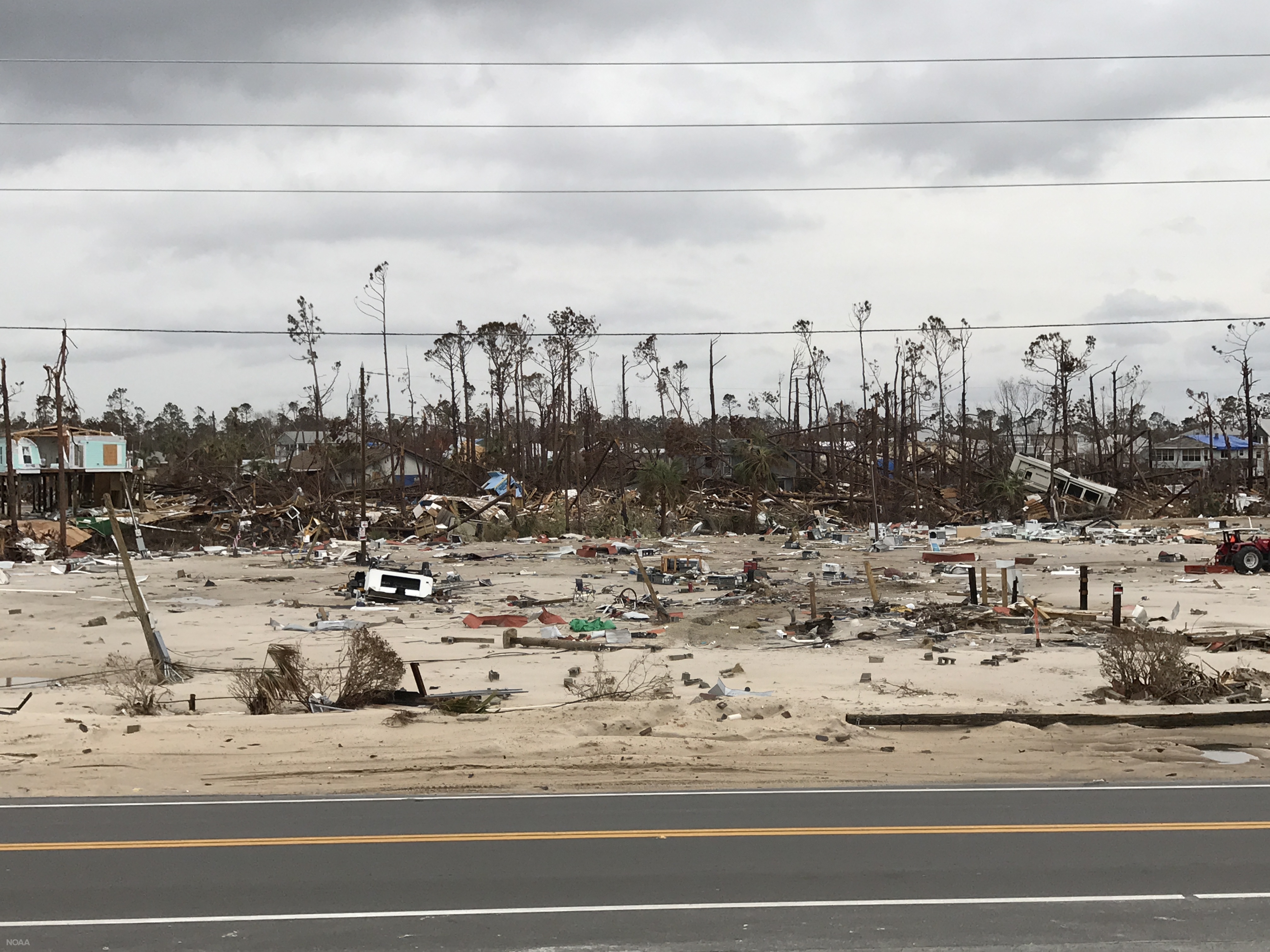
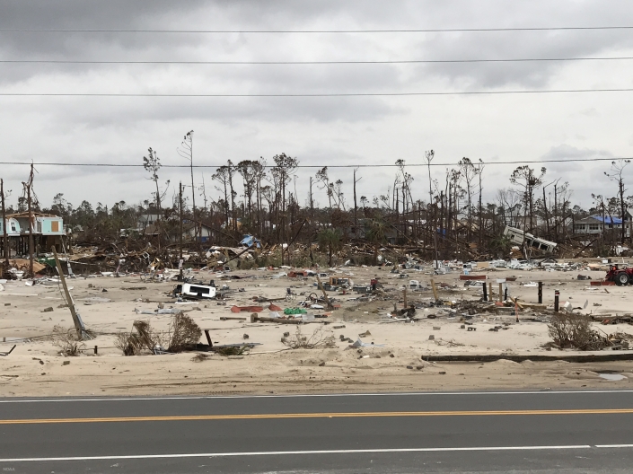 Mobile home park on the north side of U.S. Highway 98 in Mexico Beach, Florida, washed away by the storm surge and wave impacts of Hurricane Michael. Nov. 2, 2018 (NOAA)
If you were asked to define the word “risk”, what would your response be? What are the first things that come to mind? What questions are you asking? What are some things you would consider to be risky? Risk can take many forms, be it financial, personal injury, or even simple decisions that we all have to make on a daily basis. Consider two simple questions:
- Should I change the tires on my car?
- Should I change the tires on my car today
From a risk perspective, how has the question changed? The answer to the first question is a simple one because it’s general in nature. Yes, the tires should be changed somewhat routinely over the lifetime that you own or lease the car. Question two requires more thought, however, because it narrows the task down to a specific time frame. If your tires were changed recently and are in good shape, then it’s most likely business as usual. If you’re overdue, what are the potential consequences of not having your tires changed? Are you risking personal injury to yourself, your family, or others by not changing them? The risk profile changes based on myriad variables that exist. As this example conveys, the idea of risk is relatively simple in itself but can become complex quickly. Let’s define risk for now as the potential of gaining or losing something of value. That is to say:
Risk = Probability x Consequence
Yes, we threw some math at you, but this concept is relatively easy to grasp. Using the previous example, the overall risk profile is determined by multiplying the probability of a given event by the resulting consequence if that event occurs. So if there is a high chance of an event occurring, or the consequence is severe, then the risk to you would be high. One way to look at risk is by using a risk matrix, as shown below in Figure 1. Your risk increases if the probability of the event goes up or if the consequence of the event goes up.
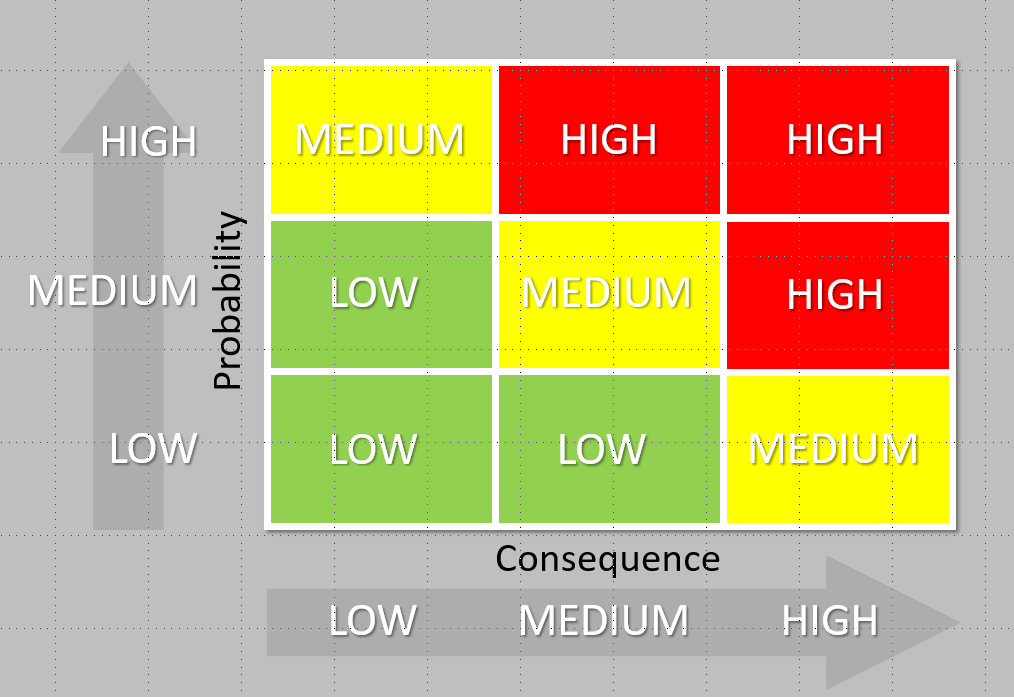
Figure 1. Risk matrix showing different levels of risk based on the probability of an event and the consequence if that event occurs.
The event in our car example is blowing a tire on the interstate, and a potential consequence would be having a fatal accident due to the blown tire. That consequence is so severe that your risk is quite high. But let’s take the example a little further. Risk is further compounded by vulnerability. Let’s consider a new equation:
Risk = Probability x Consequence x Vulnerability
Using the same example, what are variables that could increase the vulnerability, and thus the risk of a fatal accident, in this scenario? Are there kids in the car? What speed is the car travelling? If the tire pops while backing out of the driveway, isn’t that much different than the tire popping while travelling 70 mph down a busy interstate? This is just one of many examples that we all encounter on a daily basis. If there is a consequence to an action you might take, then you are making a risk-based decision.
Risk Perception and Risk Tolerance
There are two other topics related to risk that we should touch on: risk perception and risk tolerance. First, risk perception is the subjective judgement people make about the severity and probability of a risk. Why is this important? Well, there are two main reasons:
- Actual risk usually doesn’t equal perceived risk
- Perceived risk varies from person to person
Why does this complicate matters? When people have to make decisions, it’s important that how they perceive the risk be equal to the actual risk of the event, or at least as close to equal as possible. This is especially true when there is a desired response or action that needs to be taken to protect life and property, as is often the case with weather. We can use a simple example to further understand this. If a tornado is on the ground moving towards a community, the desired action for people living within that community is to seek shelter. In this scenario, the cost of persons within that community not seeking shelter is very high given that their lives are potentially in peril. If people dismiss what that tornado could do to their community (e.g., “tornadoes always pass our city to the south”), then that can be a recipe for disaster, especially when the cost is human lives.
This leads us nicely into risk tolerance. How an individual responds to risk is governed by their risk tolerance, which is unique to both the situation and the person. Risk tolerance is the amount of risk that an individual is willing to accept with respect to a given event occurring. Turning back to the tornado example, let’s consider two hypothetical people that live in the community threatened by the approaching tornado; we’ll name them Sara and Monika. For the sake of example, let’s assume that Sara has a family with two young children and lives in a mobile home. Monika, on the other hand, lives by herself in a well-built house. If Sara and Monika have the same perception of the imposing risk, do these life factors change their respective risk tolerances? In the real world it’s difficult to say, but in this idealized example, let’s assume that it does. Monika does not have anyone in her care and also lives in a home that could withstand stronger winds than Sara’s mobile home. Is Monika’s tolerance for risk higher than Sara’s? It certainly could be, couldn’t it? Again, we understand that assumptions are being made here, but this is simply a hypothetical scenario to demonstrate how risk tolerances may change across individuals and circumstances unique to those individuals. All of this is to say that humans are complicated and risk perceptions and tolerances vary across all of us.
Circling back to the initial equation that we used to define risk, let’s establish a baseline for what the potential consequences are with respect to storm surge by looking at history. Storm surge is the abnormal rise of the ocean produced by a hurricane or tropical storm, and normally dry land near the coast can be flooded by the surge. Historically, about 50% of lives lost in landfalling tropical cyclones in the United States have been due to storm surge (Figure 2):
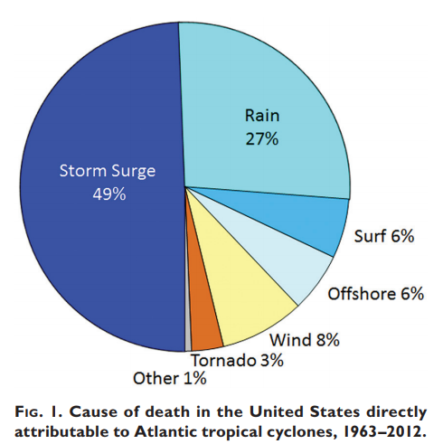
Figure 2. Causes of death in the United States directly attributable to Atlantic tropical cyclones, 1963-2012 (Rappaport 2014).
The mission statement of the National Weather Service charges us to “provide weather, water, and climate data, forecasts and warnings for the protection of life and property and enhancement of the national economy.” There is no clearer way to illustrate what the consequences are in this equation: the loss of human lives. Because the cost here is so high – arguably the highest – our risk tolerance for your safety is extremely low. We have absolutely no appetite for someone losing their life from a weather event. This idea directly informs many of the products that we use to communicate risk prior to and during landfalling storms, and we therefore use near-worst-case scenarios to encapsulate the full envelope of storm surge risk to communities. One life lost during a storm is one life too many. The remainder of this blog post will discuss two such products used by the National Hurricane Center and emergency managers to understand storm surge risk.
MOMs and MEOWs
Can we all agree that “MOMs” are extremely important? Well, yes, those moms are important in our lives, but that holds true for storm surge MOMs as well. Have you ever wondered how officials decide what areas should evacuate ahead of a hurricane? Look no further. MOMs (Maximum of the Maximums) are the rock from which the nation’s storm surge evacuation zones are built upon. MOMs are generated ahead of time. That is to say that these are precomputed maps meant for planning and mitigation purposes well ahead of a landfalling hurricane. In fact, one can view these any time as they are hosted on the National Hurricane Center’s website at https://www.nhc.noaa.gov/nationalsurge/. MOMs are generated by hurricane category (think 1-5) and depict the maximum storm surge height possible across all storm surge attributes. Attributes include things such as forward speed, storm trajectory, and landfall location, just to name a few. Because this product is designed for planning, you can think of the MOM as a worst-case scenario for a given category of a storm. MOMs do have limitations, however. Remember at the beginning of this post we asked the question “should I change the tires on my car?” MOMs are similar to that question because they are general in nature in that they lump all types of hurricanes into a single category. They can tell you what type of storm surge risk you would have from a category 3 hurricane, for example, but they’re not quite as helpful if you know that the category 3 hurricane will be moving toward the west (and not north or northeast for instance).
For this reason, the MOMs have a slightly more refined counterpart – MEOWs (Maximum Envelope of Water). MEOWs are like the second question we asked: “should I change the tires on my car today.” Since we said “today,” we know a little bit more about the actual situation we’re dealing with to make a better-informed decision. Similarly, once a storm or hurricane forms and is within 3–4 days of impacting the coast, we have at least some idea of how strong it could get, how fast it’ll be moving, and in what general direction it’s headed. We are able as forecasters to whittle down the worst-case MOM such that we only consider storms moving toward a particular direction at a particular forward speed — not all directions and forward speeds. Similar to the Maximum of Maximums, a MEOW is a worst-case for storms of a certain strength (for example, Category 3 hurricanes), but it’s more representative of what the storm surge at individual locations could be based on the attributes and forecasts of the active tropical cyclone. At 3 days out, there is still considerable forecast uncertainty, so the MEOW is meant to supplement the MOM, not replace it. As some might say, you can’t go wrong if you always trust your mom. The same adage goes for a hurricane storm surge MOM.
Hurricane Florence
To help us better understand these products, let’s look at how they could have been used in practice during a past landfalling hurricane. Hurricane Florence made landfall along the North Carolina coast on Friday, September 14th of 2018 and presented numerous forecast challenges, as many landfalling tropical cyclones typically do. One benefit of using MOMs and MEOWs to plan, especially at longer lead-times, is that they provide stability in a situation where the forecast of the storm itself can often change quickly from advisory to advisory. Let’s take a look at what Florence’s forecast looked like about 5 days out from an expected landfall. Figure 3 is taken from the official forecast from the National Hurricane Center on September 8th at 11 pm AST.
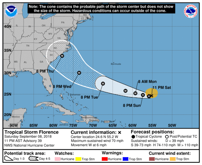 Figure 3. NHC five-day forecast track and cone of uncertainty issued for Tropical Storm Florence at 11 PM AST September 8, 2018 (Advisory 39).

At this point, the information we know is that a potential major hurricane is roughly 5 days away from impacting some portion of the Mid-Atlantic or southeast coast. This is a good point to begin looking at the MOMs. Florence at this point is forecast to be a category 4 hurricane at landfall, so a good rule-of-thumb to follow is to look at a MOM one category higher than the forecast intensity. Let’s take a look at the Category 5 MOM to get an idea of a worst-case storm surge scenario for a portion of the North Carolina coast. You can find that image below in Figure 4.
 Figure 4. Category 5 storm surge Maximum of Maximums (MOM) for portions of eastern North Carolina.
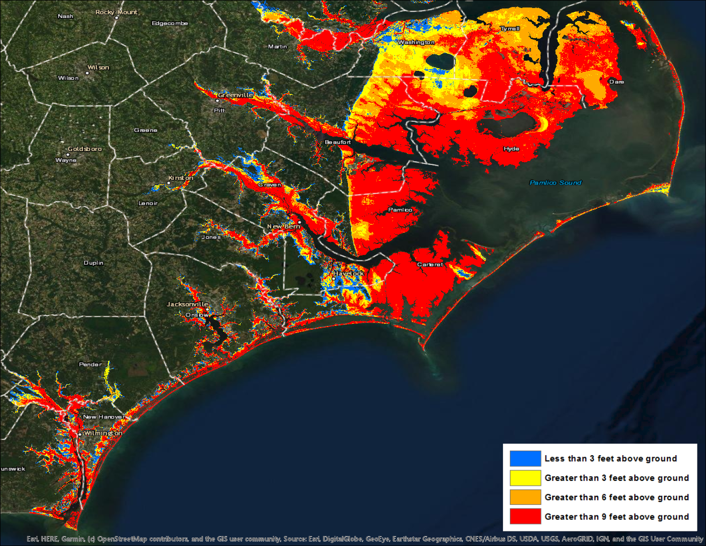
Given how strong Florence could be, it’s no surprise to see potential inundation that would be catastrophic. Remember what we are looking at here and also that this is still a planning tool. This graphic is showing you the worst-case scenario from a Category 5 hurricane. That is to say that these are the highest possible inundations at each individual location for any given storm attribute. We actually shouldn’t expect to see these types of inundation values across the entire area, but given the uncertainties in the storm, all locations in this area should be prepared for these types of inundation values. It would also be prudent to consider looking at other MOMs as well, for context. For example, viewing the Category 3 and 4 MOMs gives context if Florence was to reach the coast at a lower intensity.
Good. Now let’s fast forward by 2 days. We are now 3 days out from a potential landfall. Forecast confidence has increased, but the fine-scale details are still quite blurry regarding the exact location of landfall and how strong Florence will be. But this is when you can begin to turn to the MEOWs. From this point, we can begin to whittle down the MOMs to generate a more realistic potential scenario based on the information currently available. Below in Figure 5 is the forecast from September 10th at 11 pm AST.
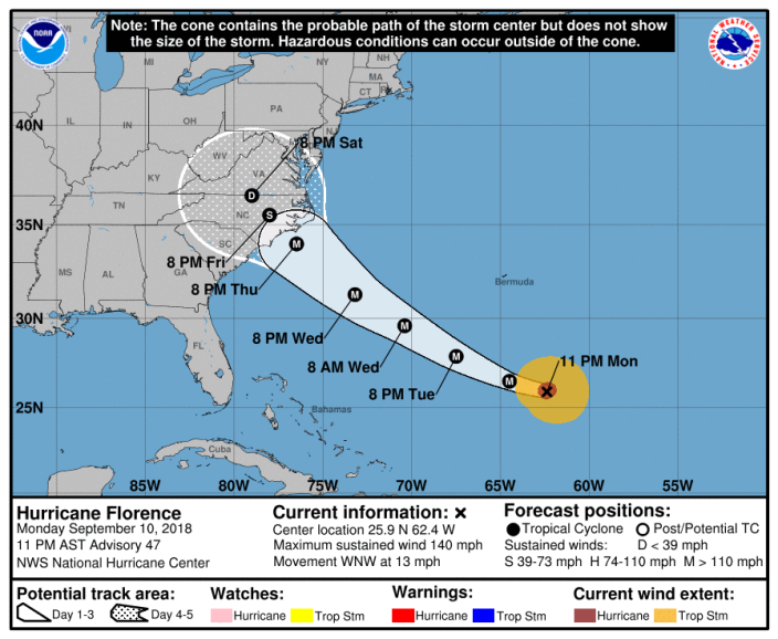 Figure 5. NHC five-day forecast track and cone of uncertainty issued for Hurricane Florence at 11 PM AST September 10, 2018 (Advisory 47).

As you can see, there are some updates to the forecast track. The official forecast now calls for Florence to slow down significantly as it approaches the North Carolina coast. Let’s now talk about which MEOWs we should be looking at and explore how we select them. This is an important junction in the forecast because right now we need to evaluate what we do know, what we don’t know, and what we can and cannot rule out. Remember that MEOWs are generated individually for a particular storm category, forward speed, trajectory, and initial tide level. At this point, is there anything that we can rule out in terms of unrealistic directions that Florence could potentially make landfall? It’s ok to acknowledge that there remains some subjectivity here, but it needs to be an informed decision with an understanding that our risk tolerance is low. That being said, let’s go ahead and rule out some storm directions. Since the forecast track in advisory 47 reflects a northwestward trajectory at landfall, we’ll select that direction, as well as the two surrounding it (west-northwest and north-northwest) to account for uncertainty. How about the intensity? The latest forecast still shows Florence reaching the coast as a category 4 hurricane, so we still need to account for the possibility that it makes landfall one category stronger (category 5). Lastly, let’s consider the speed at which Florence is moving and will be moving near its landfall. The tropical cyclone forecast discussion from advisory 47 explicitly mentions that Florence is expected to decrease in forward speed as it approaches the coast:
“After that time [48 hours], a marked decrease in forward speed is likely as another ridge builds over the Great Lakes to the north of Florence.”
This is reflected in the official forecast which slows Florence down to less than 10 mph near the coast. While this certainly complicates the forecast, the beauty of using MEOWs is that it allows you to compensate for this forecast uncertainty. In this case, it’s fair that we could eliminate the MEOW forward speeds of 15, 25 and 35 mph, given forecaster confidence in Florence’s slow down. This leaves us with a forward speed of 5 mph (only a certain set of speeds is actually available to select).
Let’s quickly recap the parameters that we’ve settled on to generate our MEOW:
Intensity: Category 5
Direction/trajectory: Storms that are moving West-Northwest, Northwest, or North-Northwest
Forward Speed: 5 mph
Tide-level: High (this will always be the assumption)
Using those parameters, Figure 6 shows the potential storm surge inundation that could occur across eastern North Carolina:
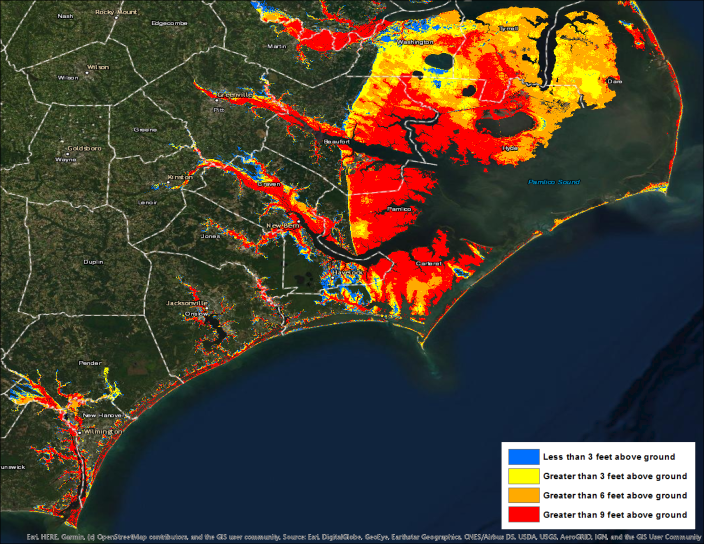 Figure 6. Composite storm surge Maximum Envelope of Water (MEOW) over portions of eastern North Carolina for a category 5 hurricane moving west-northwest, northwest, or north-northwest at 5 mph at high tide.

To take this one step further, let’s zoom in around the New Bern, North Carolina, area and do a quick comparison of the category 5 MOM that we initially used 5 days out and compare it to the composite of MEOWs (Figure 7).
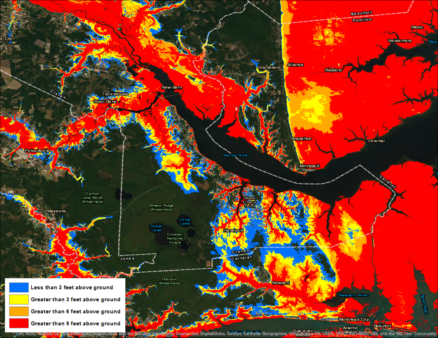
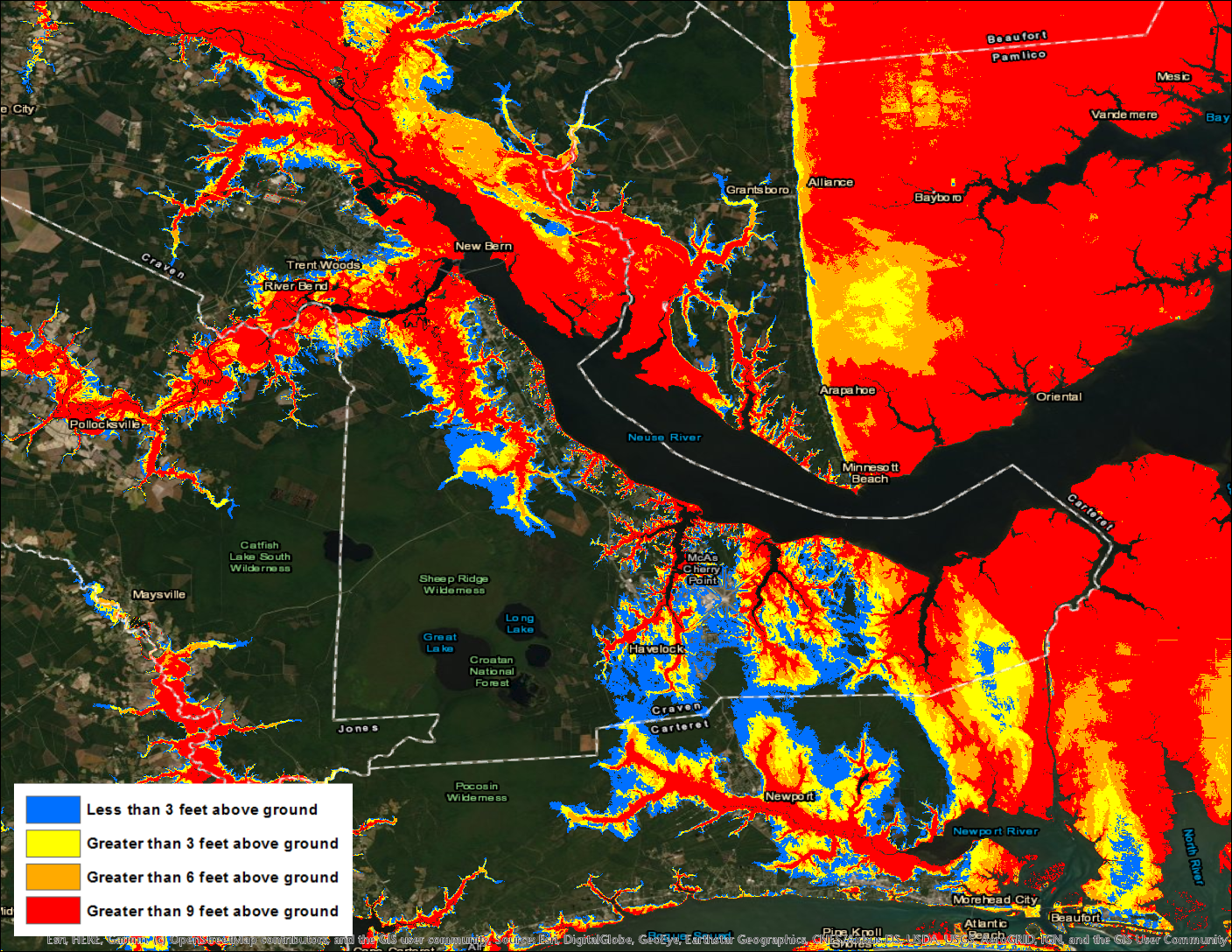
Figure 7. Comparison of MOM (left) and composite MEOW (right) from Figures 4 and 6 above, zoomed in on the New Bern, North Carolina, area.
Remember that at this point in the forecast process, we are looking at synthetic or simulated storms to get an idea of what the near-worst case storm surge inundation could be within an environment characterized by forecast uncertainty that’s very high. What differences do you notice when you compare the two pictures above? Don’t worry–you’re eyes aren’t deceiving you. You probably don’t notice much difference at all. That’s because, unfortunately, slow-moving storms moving in a generally northwestward direction are likely some of the worst types of storms for the New Bern area. Essentially, they’re the storms that are most likely to be causing the storm surge heights you see in the MOM. Our confidence in the hurricane’s forecast has increased since we’re 2 days closer to landfall, but the storm surge risk really hasn’t gone down at all. While that might be a sobering thought, this process allows emergency managers to be as efficient as possible, appropriately assess their risk, and focus on the most at-risk areas. This is a powerful and informative process when used properly!
In the end, while all of eastern North Carolina did not experience the type of storm surge flooding shown in Figure 6 above (which we didn’t expect anyway), some areas did. Areas around New Bern, for instance, had as much as 9 feet of storm surge inundation above ground level (red areas in Figure 8 below). Even though Florence’s peak winds decreased while the storm moved closer to the coast, the MOM and MEOW risk maps accounted for Florence’s increasing size and slow movement (which both contribute to more storm surge) and appropriately prepared emergency managers in the area for a severe storm surge event days before Florence even reached the coast.
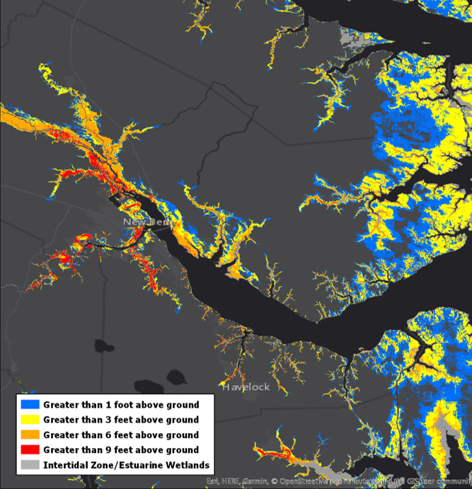
Figure 8. Post-storm model simulation of storm surge inundation caused by Hurricane Florence around the New Bern/Neuse River area of North Carolina.
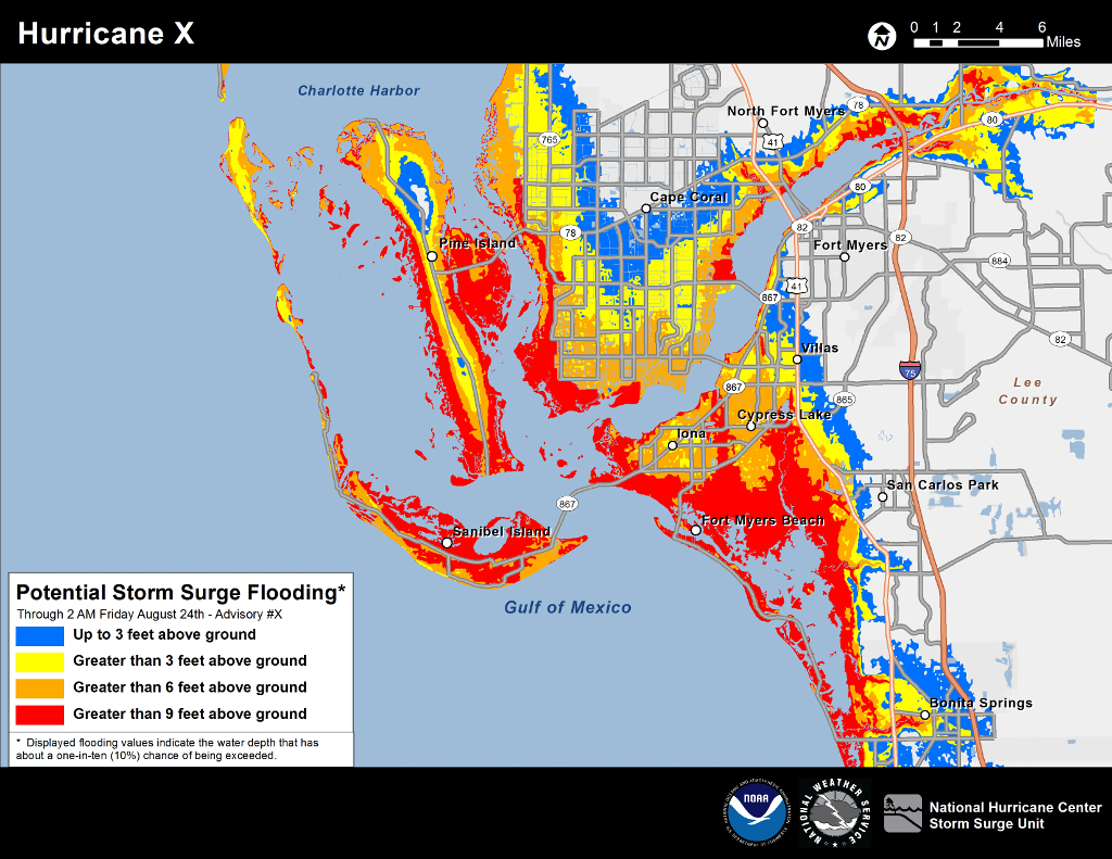
It’s important to note at this point that MOMs and MEOWs are predominantly used during the period before storm surge or wind-related watches and warnings are in effect for the coast (more than 48 hours before wind or surge is expected to begin). Once we get to within 48 hours when watches or warnings go into effect, another suite of storm surge products–specifically the Potential Storm Surge Flooding Map and the Storm Surge Watch/Warning graphics–become available. These products refine the storm surge risk profile even further because they are based on the characteristics of the actual storm, not on the simulated storms used in MOMs and MEOWs. We plan to create another blog post addressing these products in the near future.
To really bring this home, let’s circle all the way back around to the initial discussion of risk. How does risk tolerance and risk perception affect how these products are used? We know that these products are used by a wide range of people and organizations, all of which have varying tolerances of risk. It is unrealistic to assume that we at the National Hurricane Center could know how these tolerances change across our entire user base. That being said, it is our job to gently guide the decision-making in accordance with our own risk tolerance. Said another way, we work with emergency managers and the Hurricane Liaison Team (HLT) to hopefully bring those risk perceptions more in line with the ACTUAL risk for a given storm. Emergency managers have the resources at their disposal to view MOMs and MEOWs to build out their assessment of risk tailored to their local areas. They possess the intricate knowledge specific to their area which makes them invaluable partners to us at the NHC. During a storm, we sometimes provide advice on types of MOMs and MEOWs to consult to ensure that our partners fully capture a reasonable envelope of risk. These decisions can be stressful, especially when they have to be made in line with a risk tolerance that needs to be low by necessity. Remember what the cost is again here: human lives. It’s imperative that we capture the full breadth of the risk during every storm because the cost of not doing so is immense. We are comfortable accepting that our low risk tolerance can result in some areas not experiencing the potential storm surge that was conveyed prior to a hurricane making landfall. That is, by definition, what having a low tolerance for risk means, but it’s also by design. To us, one life lost is one life too many.
— Taylor Trogdon and Robbie Berg
Reference:
Rappaport, E.N., 2014: Fatalities in the United States from Atlantic Tropical Cyclones: New Data and Interpretation. Bull. Amer. Meteor. Soc., 95, 341–346, https://doi.org/10.1175/BAMS-D-12-00074.1
Share this:

The Alphabet Soup of Vertical Datums: Why MHHW is Mmm Mmm Good

Last weekend’s blizzard along the East Coast of the United States caused significant flooding along the coasts of Maryland, Delaware, New Jersey, and New York. Even though this system was not a tropical cyclone, the mechanics of storm surge flooding are essentially the same whether the cause is a hurricane or extratropical storm. The blizzard provides us an excellent opportunity to delve into the topic of vertical datums, which we promised to tackle in a previous blog post anyway!
You Say MLLW, I say MHHW (and undoubtedly someone else says NAVD88)
Simply put, a vertical datum is a reference level. Whenever you talk about water levels related to tides or storm surge, that water level needs to be referenced to some datum to provide essential context. For example, a water surface 2 feet above the floor means something very different than a water surface 2 feet above the roof.
There are many vertical datums out there. Some are based on tide levels (tidal datums), while some are based on the general shape of the Earth (geodetic datums). Savvy and more technical experts generally use geodetic datums such as the North American Vertical Datum of 1988 (NAVD88) because they’re more precise and applicable to a large area, such as an entire continent. For most of us, however, we see water levels referenced to tidal datums such as Mean Lower Low Water (MLLW) or Mean Higher High Water (MHHW).

Some locations along the coast have two high tides and two low tides per day (e.g., the U.S. East Coast), while some areas only have one high tide and one low tide per day (e.g., the U.S. Gulf Coast). Mean Lower Low Water (MLLW) is simply the lowest of the two low tides per day (or the one low tide) averaged over a 19-year period. This 19-year period is called the National Tidal Datum Epoch, which currently runs from 1983 through 2001. So to calculate MLLW for a particular tide station, the National Ocean Service (NOS) took the levels of all the lowest low tides from 1983 to 2001 and averaged them. Similarly, NOS calculates Mean Higher High Water (MHHW) by averaging the highest of the two high tides per day (or the one high tide) over the same 19-year period.

Historically, MLLW has been used for navigational purposes in the marine waters of the United States and its territories. Navigational charts from the NOAA Office of Coast Survey show water depths relative to MLLW, or how far the ocean bottom extends below the MLLW line. If boaters know the tide forecast relative to MLLW, the depth of the ocean bottom relative to MLLW, and the draft of their boat or ship (the distance between the waterline and the bottom of the hull), then they can deduce if the vessel will hit the sea floor. Since this is the most common way that tides have been referenced, the National Weather Service (NWS) has generally used MLLW as a reference for its water level forecasts, and most tide gauge data is referenced to MLLW by default. People who have lived along the same stretch of coastline for many years have become accustomed to knowing what type of coastal flooding will occur when water levels reach specific thresholds above MLLW.
But what about people who don’t know those relationships between MLLW–or any other datum for that matter–and coastal flooding (which change from location to location along the coast, by the way). For this reason, NHC has moved toward providing tropical cyclone related storm surge forecasts in terms of inundation, or how much water will be on normally dry ground. You can go here for more information on the Potential Storm Surge Flooding Map, issued by NHC when tropical cyclones are forecast to affect the East or Gulf Coasts of the United States. For the purposes of using water level observations to get an idea of how much inundation is occurring during a storm, NHC uses MHHW.
Why Does NHC Use MHHW When Looking at Water Level Observations?
To answer this question, it’s probably helpful to look at a cross-section of a typical coastline. Shown below is such a schematic, which depicts both the Mean Lower Low Water line and the Mean Higher High Water line. Anything seaward of the MLLW line is typically submerged under water. The region between the MLLW and MHHW lines is called the intertidal zone, and it is the region that is submerged at high tide and exposed at low tide. Intertidal zones include rocky shorelines, sandy beaches, or wetlands (marshes, mudflats, swamps, and mangroves). Because intertidal zones are submerged during a typical high tide, people don’t generally live here.

NHC and NOS consider anything landward of the MHHW line (marked as the supratidal zone in the graphic) as normally dry ground. Only in the most extreme high tide cycles and during storm surge or tsunami events does that region become submerged under water. Seawater that rises past the MHHW line is considered inundation, and therefore water level measurements relative to MHHW can be considered as proxies for measurements of inundation. NOS has deemed MHHW as the best approximation of the threshold at which inundation can begin to occur. While safe navigation of boats is a downward-looking problem that requires the use of MLLW, coastal flooding is an upward-looking problem that is best communicated using MHHW.
Dr. J. D. Boon, Professor Emeritus of the Virginia Institute of Marine Science, probably puts it best in his book Secrets of the Tide:
…we require the MHHW datum in order to isolate and evaluate storm surge risk
in a conservative way by removing the effect of tidal range – an independent factor
that varies from place to place.…US nautical charts use MLLW to reference charted depths conservatively so that
a mariner will know that the water depths shown on the chart can be counted on for
safe passage even at the lowest levels of the astronomical tide…Reversing direction and looking upward instead of downward, MHHW can be used to
conservatively reference storm tides so that coastal residents will know how much
additional rise to expect above the highest levels of the astronomical tide.These levels are generally familiar to the waterfront resident who witnesses signs of
their presence in wrack lines, marsh vegetation zones and high water marks on
structures.
We should mention that use of other vertical datums is in no way wrong. There are some very good uses for datums such as MLLW or NAVD88, but NHC uses MHHW when referencing storm tide observations to put things into a frame of reference that is understood by the majority of people at risk for coastal flooding. If we see a water level observation of 7 feet above MHHW, there’s a pretty good chance that some location in that area is being or was inundated by as much as 7 feet of water on ground that would normally be dry. This relationship worked quite well during Hurricane Sandy in 2012. Peak water levels measured by NOS tide gauges at the Battery in Manhattan and Sandy Hook, New Jersey, were between 8 and 9 feet above MHHW, and high water marks surveyed by the US Geological Survey after the storm indeed supported inundations of 8 to 9 feet above ground level in places like Sandy Hook and Staten Island.
MHHW and the January 2016 East Coast Blizzard
Since we said the recent blizzard provides a great case for us to explain vertical datums, let’s take a look at some of the water level observations during the event and how they compared to documented flooding.

Some of the worst storm surge flooding from the event occurred in extreme southern New Jersey and Delaware. So let’s look at the area around Cape May, New Jersey. The NOS tide gauge at Cape May measured a peak water level of about 9 feet above MLLW (8.98 feet to be exact). But does that mean that residents of Cape May and surrounding communities had as much as 9 feet of water on their streets? No, it just means that the water surface got about 9 feet higher than the “imaginary” line that marks the average of the lowest of the two low tides per day.
At the Cape May gauge, the difference between MLLW and MHHW is 5.45 feet, which means that the peak water level was only about 3.53 feet above MHHW (8.98 minus 5.45). Nearby, the peak water level observation from the NOS gauge in Atlantic City, New Jersey, was 3.42 feet above MHHW. So does that mean that residents of Cape May, Atlantic City, and surrounding communities had as much as 3 to 4 feet of water on their streets? Actually, yes it does. Pictures obtained via Twitter from West Wildwood, North Wildwood, and Atlantic City appear to support an estimate of 3 to 4 feet of inundation. See below for the evidence.


Incidentally, if you’re ever watching water level observations during a storm from the NOS Center for Operational Oceanographic Products and Services (CO-OPS) website, you can choose which vertical datum you’d like to use. The default will come up as MLLW, but you can change it to MHHW (as we do at NHC) or another datum such as NAVD88 or Mean Sea Level. Alternatively, NOS CO-OPS also provides a real-time “Storm QuickLook” website during coastal flooding events, and the default vertical datum on this page is MHHW. Below is a comparison of the water level data from Lewes, Delaware, during the blizzard using MLLW (top) and MHHW (bottom) as reference levels. Notice that the curves don’t change, only the reference numbers on the left vertical axis.
And finally, if you’re ever looking at storm surge forecast guidance online, make sure you know which vertical datum you’re looking at! For example, the NWS’s Extratropical Storm Surge (ETSS) model is available on the Meteorological Development Laboratory website, and although data shown is relative to Mean Sea Level (MSL), the vertical datum can be changed to MHHW or MLLW.
— Robbie Berg
Thanks go out to Cody Fritz, Shannon Hefferan, and Jamie Rhome from the NHC Storm Surge Unit, as well as the folks over at the National Ocean Service, for their assistance in putting together this blog post.
Share this:

Storm Surge–Plain and Simple (Part 2)
In our last storm surge post, we talked about the need for a storm surge graphic and why we use “above ground level” to communicate storm surge forecasts. Now we’ll discuss how we create the new storm surge graphic.
But first, we need to touch on how forecast uncertainty relates to storm surge forecasting.
Putting All Your Eggs in One Basket
The exact amount of storm surge that any one particular location will get from a storm is dependent on a number of factors, including storm track, storm intensity, storm size, forward speed, shape of the coastline, and depth of the ocean bottom just offshore. Needless to say, it’s a complex phenomenon. Although we’re getting better on some aspects of hurricane forecasting, we still aren’t able to nail down the exact landfall of the storm or exactly how strong and big the storm will be when it reaches the coast. This means that there is a lot of uncertainty involved in storm surge forecasting. Here’s an illustration showing why all of this is important.
Here’s the forecast track for a Category 4 hurricane located southeast of Louisiana and only about 12 hours away from reaching the northern Gulf Coast:

Here’s the question: how much storm surge could this hurricane produce in Mobile, Alabama, and Pensacola, Florida (marked on the map)? If we take this forecast and run it through SLOSH (the National Weather Service’s operational storm surge model), here’s what you get:

The forecast has this hurricane making landfall near Dauphin Island, with the center moving northward just west of Mobile Bay along the black line. You can see from this map that water levels will rise to at least 14 ft. above NGVD29 (the particular reference level we are using in this scenario) in the upper reaches of Mobile Bay while they will rise to about 2 ft. above NGVD29 in the Pensacola area. What’s the problem with this storm surge forecast? It assumes that the track, intensity, and size forecasts of the hurricane will all be perfect. This is rarely, if ever, the case.
Here’s what actually happened with this hurricane. The storm turned ever so slightly toward the east and made landfall about 30 miles east of where the earlier forecast had shown it moving inland. Despite the shift, this was a good track forecast–30 miles is more or less typical for a 12-hour error. So, what kind of storm surge resulted from the actual track of this hurricane? If we take the actual track of the storm and run it through SLOSH, here’s what we get:

Since the center of the hurricane actually moved east of Mobile Bay, winds were pushing water out of the bay, and the water was only able to rise about 4-5 ft. above NGVD29 near Mobile. On the other hand, significantly more water was pushed toward the Pensacola area, with values as high as 12 ft. above NGVD29 in the upper reaches of Pensacola Bay.
This scenario was an actual storm–Hurricane Ivan in 2004. If emergency managers in Pensacola at the time had relied on that single SLOSH map that was based on a perfect forecast (or, put all their eggs in one basket), they would have been woefully unprepared and may not have evacuated enough people away from the coast. Granted, such decisions would have been made more than 12 hours away from landfall, but at that time, forecast errors are even larger and make storm surge forecasting even more difficult.
Scrambled Eggs?
If you’re going to put all your eggs in one basket, you might as well scramble them beforehand so that they don’t break when you drop the basket. In a sense, that’s what we do when trying to assess an area’s storm surge risk before a tropical cyclone. Instead of assuming one perfect forecast, we generate many simulated storms weighted around the official forecast–some to the left, some to the right; some faster, some slower; some bigger, some smaller–and then run each of those storms through SLOSH. We then “scramble” the SLOSH output  from all storms together and derive statistics that tell us the probability of certain storm surge heights at given locations along the coast.
If we go back to our example from Hurricane Ivan, we can see the value of this method in assessing storm surge risk. The image below shows the probability that the storm surge would reach at least 8 ft. above the reference level (NGVD29) for Ivan from the NHC Tropical Cyclone Storm Surge Probability product. The first thing that should jump out at you is that the probability of at least 8 ft. of surge was just about equal in Mobile Bay (60-70% chance) and Pensacola Bay (50-60% chance). The probabilistic approach indicates that both areas were at a significant risk of storm surge, and both areas should have been preparing similarly for the arrival of the storm. Because we accounted for the uncertainty in the official forecast, we were able to assess the true storm surge risk for all areas near the coast.

The Tropical Cyclone Storm Surge Probability product provides the data that are used to create the Potential Storm Surge Flooding map that will be available experimentally beginning in the 2014 hurricane season. In other words, the Potential Storm Surge Flooding map accounts for the uncertainties associated with NHC’s tropical cyclone forecasts. In Part 3 of this storm surge series, we’ll talk more about the map itself and how it should be interpreted.
— Robbie Berg and Jamie Rhome
Share this:

Storm Surge–Plain and Simple (Part 1)

You may have heard that NHC is unveiling an experimental storm surge graphic this hurricane season. We mentioned in our first blog post on May 29 that we would be discussing the background and interpretation of this graphic. There’s a lot to cover, so instead of throwing it all at you in one shot, we are going to do a three-part series on the new graphic and communication on storm surge in general. Here’s what we plan on covering:
Part 1: Why do we need a storm surge graphic?
Part 2: How is the storm surge graphic created?
Part 3: How should you interpret the storm surge graphic?

So, let’s get on with Part 1. First, let’s look back at a little history. Way back in 1955, the U.S. Weather Bureau issued a memo (figure to the right) to weather offices along the coast, directing them to refer to any water rise produced by a hurricane or tropical storm in terms of “above normal tide levels,” and those rises were to be specified in ranges to account for uncertainty. Believe it or not, that policy went unchanged for over 50 years! In 2008, the NHC Public Advisories for Hurricane Ike referred to storm surge like this:
“COASTAL STORM SURGE FLOODING OF UP TO 20 FEET…WITH A FEW SPOTS TO NEAR 25 FEET…ABOVE NORMAL TIDES ALONG WITH LARGE AND DANGEROUS BATTERING WAVES…CAN BE EXPECTED NEAR AND TO THE EAST OF WHERE THE CENTER OF IKE MAKES LANDFALL. THE SURGE EXTENDS A GREATER THAN USUAL DISTANCE FROM THE CENTER DUE TO THE LARGE SIZE OF THE CYCLONE. WATER LEVELS HAVE ALREADY RISEN BY MORE THAN 5 FEET ALONG MUCH OF THE NORTHWESTERN GULF COAST.”
For many years, we didn’t have the technology, nor sufficient accuracy in our track forecasts, to be any more specific in our Public Advisories. The best we could do was give an estimate of the highest storm surge expected with a general description of where that surge could occur relative to the center of the storm. Unfortunately, many times these statements were too vague for emergency managers and other decision makers to make sound decisions before a storm. One question a statement like this could not answer: “How far inland could the storm surge go?”
Another issue had to do with what are called vertical datums. We’ll leave the more technical discussion of vertical datums for another blog post, but what you need to know for this discussion is that a vertical datum is simply a reference point. The water level height caused by the combination of storm surge and the tide must be attached to some point of reference. The operative question is “the height of the water level is 6 feet above what?” The problem was that many people either weren’t specifying what the datum was, or they were confusing one datum with another.
Here’s an example, again using Ike, where confusion set in. The figure below shows output from the National Weather Service SLOSH model indicating simulated water level heights from Hurricane Ike along the Texas and Louisiana coasts. What’s the first thing that jumps out at you? The first question many people have is why do the values increase (go from 15 feet to over 21 feet) as you move inland from the coast into Chambers and Jefferson Counties in Texas? Shouldn’t the deepest water have occurred at the immediate coast? The subtlety here is that the water level in this picture is depicted relative to a datum called NAVD88. So, the water levels in Chambers and Jefferson Counties were more than 21 feet above NAVD88, not 21 feet above the actual ground at those locations.

Luckily, there’s a way to display how much water was sitting on normally dry ground, which is what most people typically envision when given storm surge heights. Since we know what the elevation of the land is at each location, relative to the same vertical datum used for the surge data itself, we can subtract the land elevation from the surge heights to get a good idea of how high the water was above the ground at each location. The next figure is the same simulation for Ike but instead shows this subtraction at play. Notice any differences from the previous image?

Now it should all make sense. The highest values (about 15 feet above ground level) are located along the immediate coast and decrease as you move inland.
Recent hurricanes like Katrina, Rita, and Ike showed that we needed to make some changes in the ways that we communicate storm surge information. And thankfully, we now have the technologies and capabilities to go beyond simplified text statements in the Public Advisory. In Part 2 of this series, we’ll talk about the Probabilistic Storm Surge product, how it accounts for uncertainties in the storm surge forecast, and how it is being used to create the Experimental Potential Storm Surge Flooding Map for this hurricane season.

